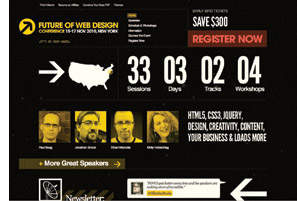
There’s an interesting article in Meetings and Conventions magazine detailing what makes “The Perfect Conference Website,” i.e. how to turn a program’s registration and information page into a marketing vehicle for the conference, generating additional traffic and interest.
Here’s the introduction:
Encouraging registration and delivering information: These are the traditional jobs of conference websites. But in the 21st century, tradition changes from year to year. Once, a person would visit a site, register and never come back. Now, websites are expected to do much more than just provide information, and people expect tools and ever-changing content that keep them returning to the site.
The challenges for those designing conference sites are many: to offer the latest tools without overwhelming users, to create a sense of excitement without neglecting important information, and to give attendees every possible way to maximize their conference experiences. What follows are ways to achieve these goals.
Image and article content, copyright © 2010 by NORTHSTAR Travel Media, LLC. All Rights Reserved.


 Get updates by email!